It’s All About the Animals
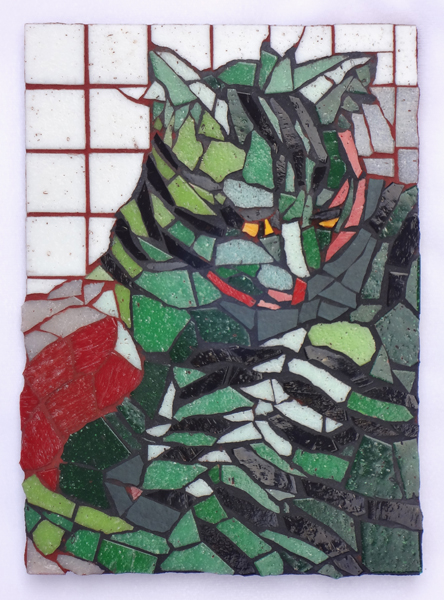
Pile of Stripes
7″ x 5″
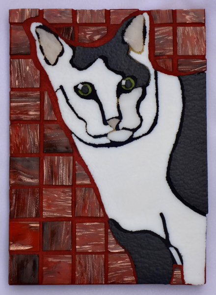
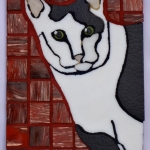
The Daily Beast
7″ x 5″
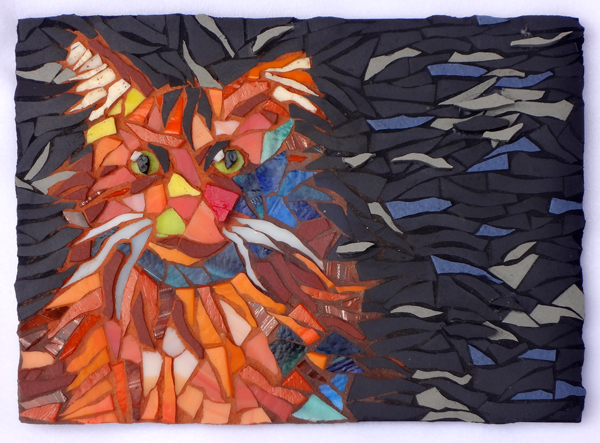
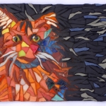
Flyaway
5″ x 7″
CAT WORLD
Living with cats in the studio all day makes me a ‘crazy cat lady’, for sure. My art-making routines center around what is safe and unsafe for the resident cats.
Make sure the cats are elevated well above the work area on their custom-made cat stands before starting to cut glass.
Make sure no cats are sniffing cement powder, or walking in glass shards. Vacuum, vacuum, vacuum!
Keep the fiberglass mesh away from Velvet, who likes to chew the stuff. Prancer has a tendency to chew on plastic bags, so, no plastic bags left in cat-reach. Look for timid little Lucy on the shelf under the light table before hauling off and running the power tools.
TRANSITION FROM MODEL TO ART
In case you are wondering what I was thinking when I made each of these mosaic cat portraits, here goes:
Green Cat
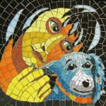
I was really happy with the composition and color of this little 12″ x 12″ piece I made for the Therapy Dog Wall at Dell Children’s Medical Center.
And, I like dogs just fine. But, I live with cats, so I thought I should challenge myself to come up with a complex cat-composition that carries well at a distance AND makes use of inventive color. So, I launched into the stripes, fur tufts, and convoluted stretchiness that is Velvet. I wanted you to be able to enjoy the puzzle-like quality of adjoining striped body parts, but I wanted you to be able to tease out the posture of the cat, too.
I recommend looking at the full portrait close-up to see the cuts, the tile layment, and the grout color, but I recommend looking at the portrait from a distance to see what are legs and what is cat bed.
Green and red are examples of ‘complementary colors’, a sort of opposites-attract arrangement that characterizes the universe. You know, like positive ions and negative ions, or cat-boy-falls-for-dog-girl, or fast, loud songs following slow and quiet ones in the concert.
Green and red play well together and they give a little visual jolt when they settle side-by-side. If you want to make a shadow in your art, you would likely mix a little bit of the complement into the color of the thing you are darkening. Other examples of complementary colors are orange and blue, as well as purple and yellow.
Black and White Cat
After the green cat, I was on a roll with this pattern-study thing, so I started on Prancer, the ‘tuxedo’ kitty. I always admire the cow-like quality of her patches, so I created a simple design of black shapes and white shapes that suggested CAT. I gave her a black leg where she has white, because I liked that pattern better in my composition. This was NOT a strict portrait.
I cut the flat-pattern shapes out of stained glass with my ring saw, which is easy to manipulate into curvy cuts. After gluing on the cat design, I was left with the question of what to use for a background.
I poured out many jars of tile to test color choices, but I decided on the classic red to set off the black and white animal. Of course, this reminded me of the old joke, “What is black and white and red (read) all over?” The answer being ‘a newspaper’. Which reminded me of a daily. Which reminded me of The Daily Beast, so there’s the title right there, the cat being a beast and all.
Orange Cat
After having made cat portraits in two completely different styles, I wanted to go for a third.
Lucy is already a little orangey, being a calico, so I went with the orange-and-blue color scheme. Complementary, remember?
Lucy is also quite furry, losing hairs at the least provocation, and she is constantly on high-alert. Her nervous system was set to ‘alarm’ in her unknown adolescence, and it is not changing now. I set the cat into the rectangle in a way that would suggest flying fur tufts and nervous energy.
All that was left was for me to cut glass and porcelain tile into thin, curvy shapes to suggest dishevelment and nervousness. After I had the cat-form glued on, I called on my Twitter and Facebook followers for a background color and a name, and they supplied me with good ideas, all related to ‘crazy’.
But, what I hadn’t counted on was the effect that grouting the piece would have on its mood. Instead of total alarm, the grout calmed the cat just a bit, and it also brought out the wispy quality of the drifting fur, so “Flyaway” came to mind.
As often happens when an artist constructs a painting or a mosaic using classic pictorial principles, the full effect becomes apparent only when viewed at a distance. This piece definitely becomes its most complete self when it is viewed from a distance.
MERRRRRROOOWWWW
So, now you know. Making a mosaic involves quite a thought process. And it is SLOW. Which is opposite from modern life. So, one more example of opposites, right? Warp-speed and snail-speed, ya know?
These pet portraits are for sale (you can see them on the website) and will be on view in the Austin Mosaic Guild window of Kruger’s Jewelers in downtown Austin from this Saturday until the first Saturday of August.

